Guest Post: The Perfect Mountain Home Palette
Denver, Colorado-based architectural color consultant and interior designer KD Fikso shares two paint palettes that will freshen up your mountain homeâand deliver a feel-good sense of place.
Much of the allure of a mountain house, whether it’s a weekend getaway, full-time residence or vacation property, is its surroundings. So how do you capture the color-filled beauty of the outdoor setting within your home?
Inspired by two natural scenes, these two paint palettes promise to pair well, but not compete, with the beauty outside.
Memory: Borrowing cozy colors from a vintage national park poster, this mountain palette is warm and livable without being bland and beige.

Photo courtesy of themidwestmaven.wordpress.com

Paint by Benjamin Moore, clockwise from top left: Pale Sea Mist 2147-50, Desert Tan 2153-50, Reflection 850, Warm Brownie 2101-30
Escape: Cool, sophisticated and earthy, this family of colors is inspired by the moody hues of a foggy California forest.

Photo courtesy of themagiconions.blogspot.com

Paints by Benjamin Moore, clockwise from top left: Taos Taupe 2111-40, Sesame 381, Bunny Gray 2124-50, Laurel Canyon Beige 242
Once you’ve chosen your hues, consider these tips for working the colors into your space:
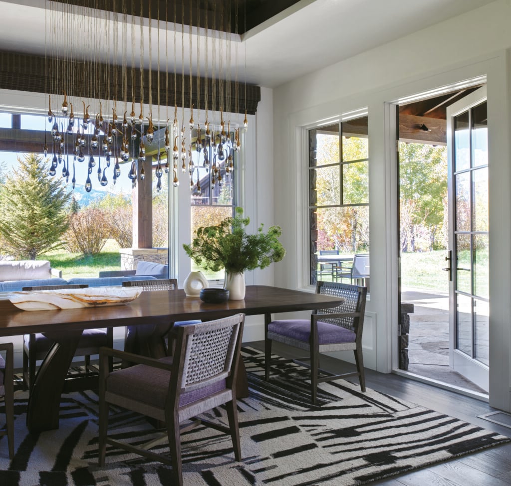
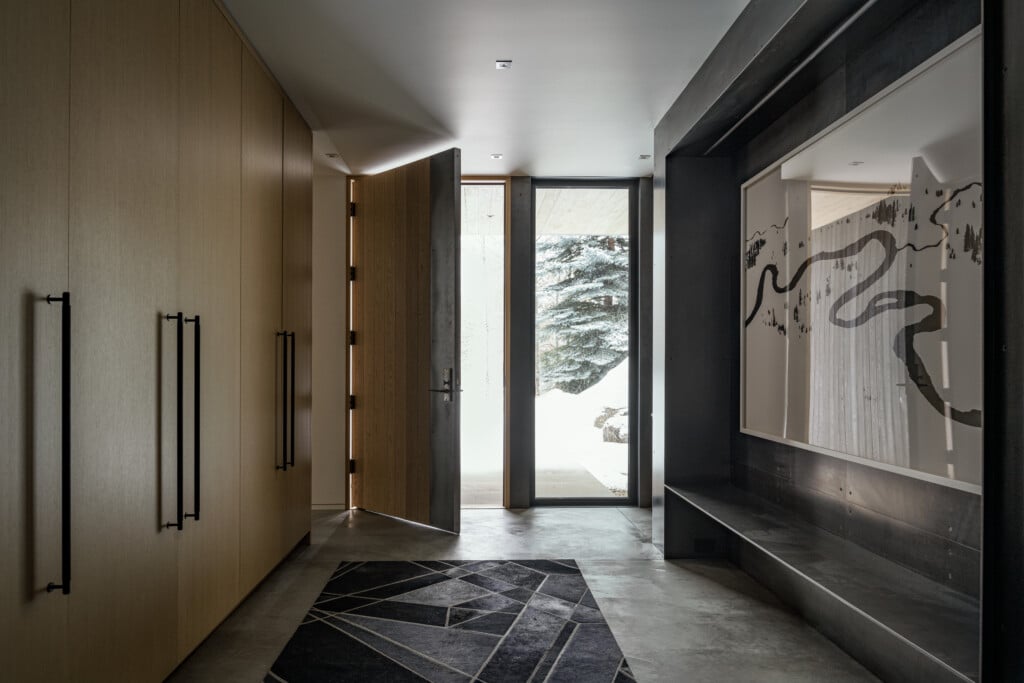
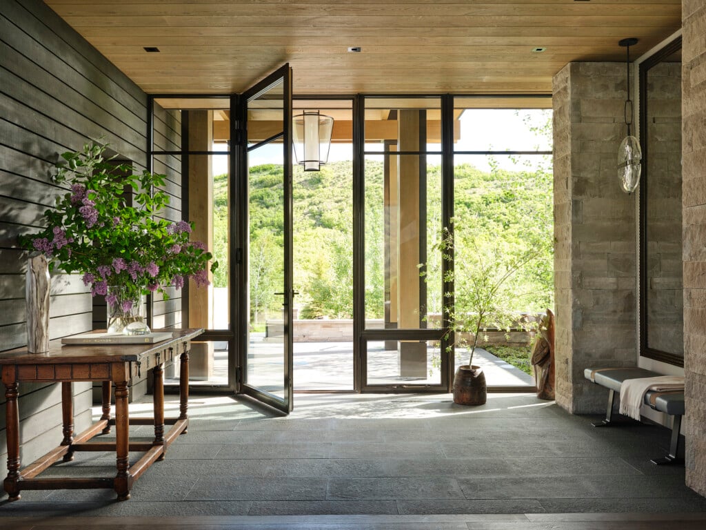
A Room with a View: To frame the beauty outside, consider deep neutral colors for walls that contain the largest windows. By exaggerating the shadows of these walls with a deep neutral color like a chocolate or a cool charcoal, you intensify the view beyond the glass.
Pale by Comparison: Rather than bring in the full vibrancy of natureâs palette, paint your walls with a mere tint of those colors to avoid competing with the views. Using textures, shapes and materials that are evocative of the surrounding landscape is a better way to capture the spirit of your locale than attempting to duplicate the colors that appear outside.
A Time and a Place: If you move forward with a palette of deep neutrals and quiet tints, then what colors go where? Consider the following question: What time of day will people be using the space and what activities will be taking place there? You’ll want to distribute the warm tints in spaces that are used mostly in the evening for entertaining: dining room, entry, living room and powder room. Cooler tints work well in task-oriented spaces, offering a refreshing crispness that focuses attention: kitchen, bathroom, gym or laundry room. In your bedrooms, opt for the deep neutrals you chose for your walls with windows.