Grounded, Warm and Enduring Mountain Home Colors Trending this Year
Color is a powerful tool that deepens our connection to nature, creates comfort and evokes a sense of calm.
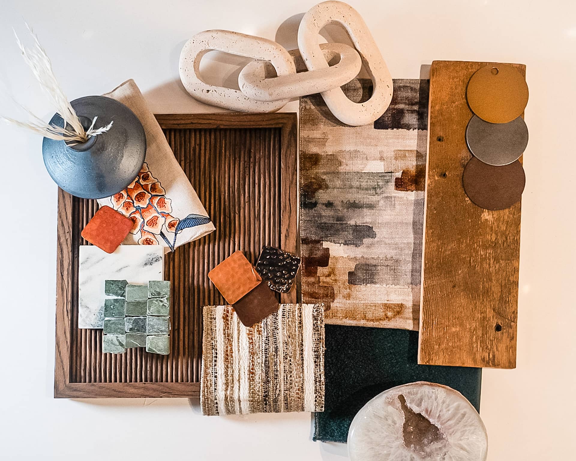
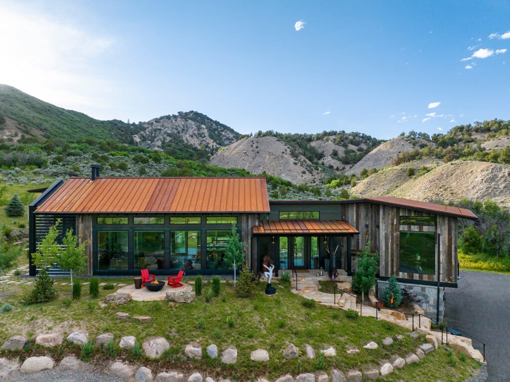
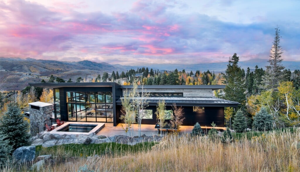
Photo: Colleen Euclide
In mountain homes, where nature is an integral part of life, color helps create a sense of retreat, warmth and connection to the outdoors. For 2025, we’re embracing a palette inspired by the mountain landscape itself—balancing earthy neutrals, rich textures and deep, nature-inspired hues to create homes that feel grounded, inviting and timeless. Read on to learn more about how these colors can transform your space into a serene mountain-inspired retreat.
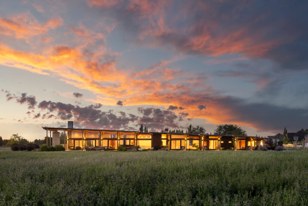
A Foundation of Subtle, Earthy Neutrals
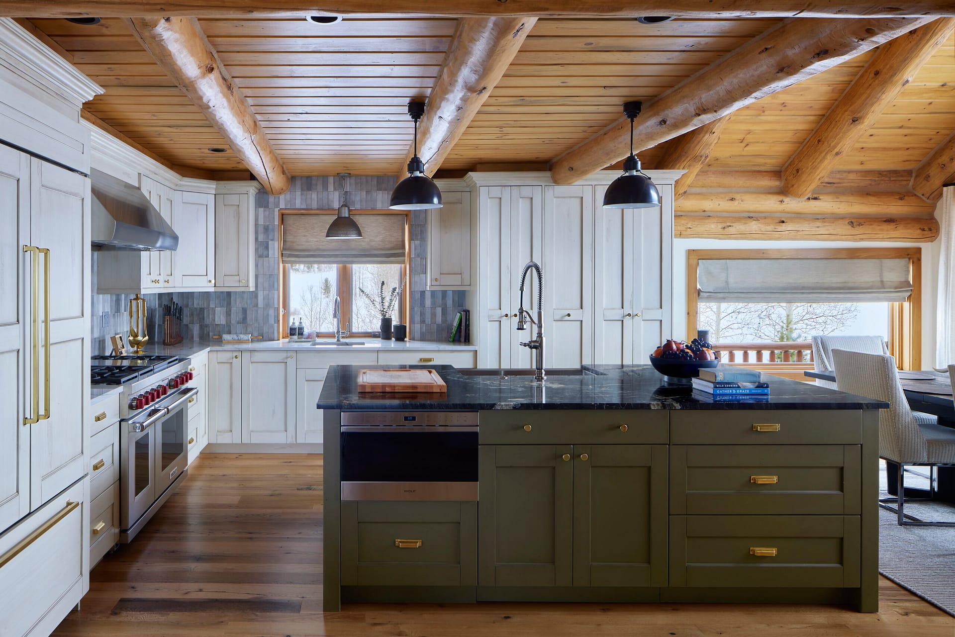
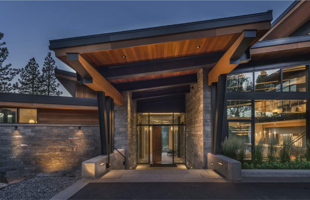
Photo: Susie Brenner
Light, natural wall colors are setting the tone, creating a calming backdrop that leaves room for layered accents in furniture, textiles and art. Shades like smoky grey-blue, rich caramel, sun-kissed beige and muted sage bring warmth and versatility that stand the test of time.
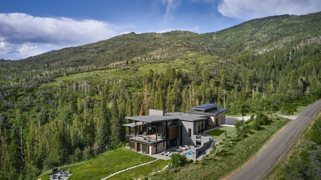
Rich, Deep Tones for Contrast and Character
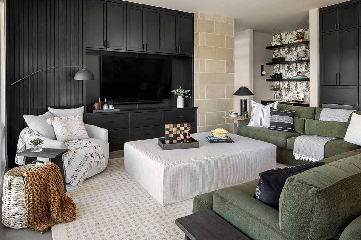
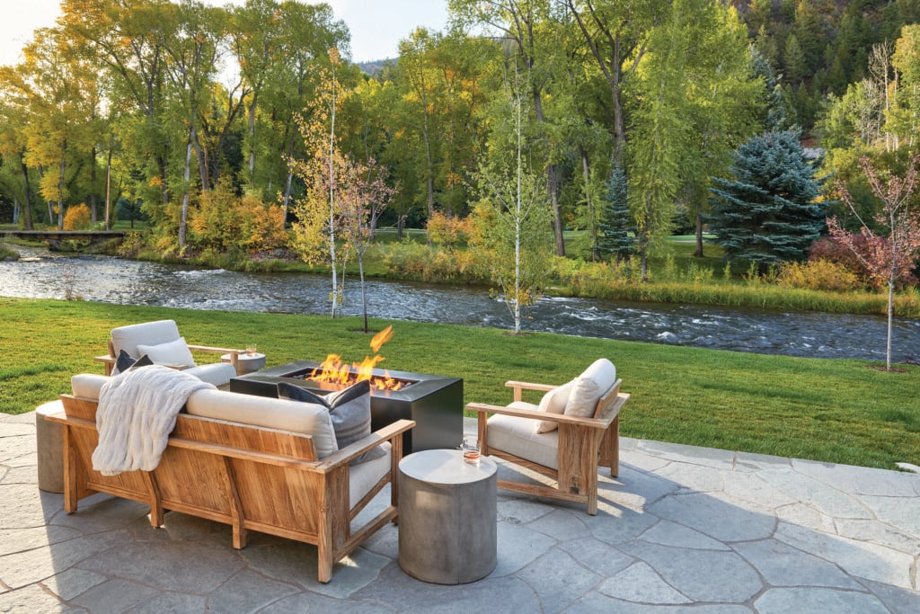
Photo: Kimberly Gavin
Inspired by the ever-changing mountain light, deeper colors like charcoal, midnight blue and earthy brown are gaining popularity. These hues provide contrast and visual weight, best used in upholstery, statement rugs, or sculptural elements for a grounded, layered effect.
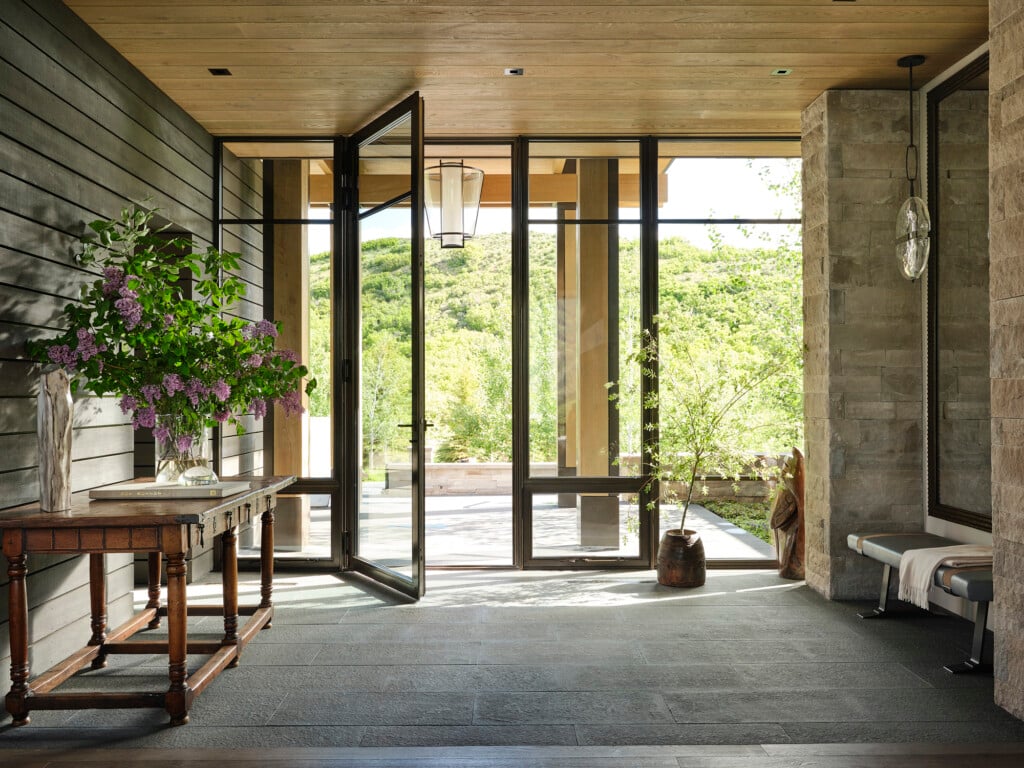
Texture as a Design Element
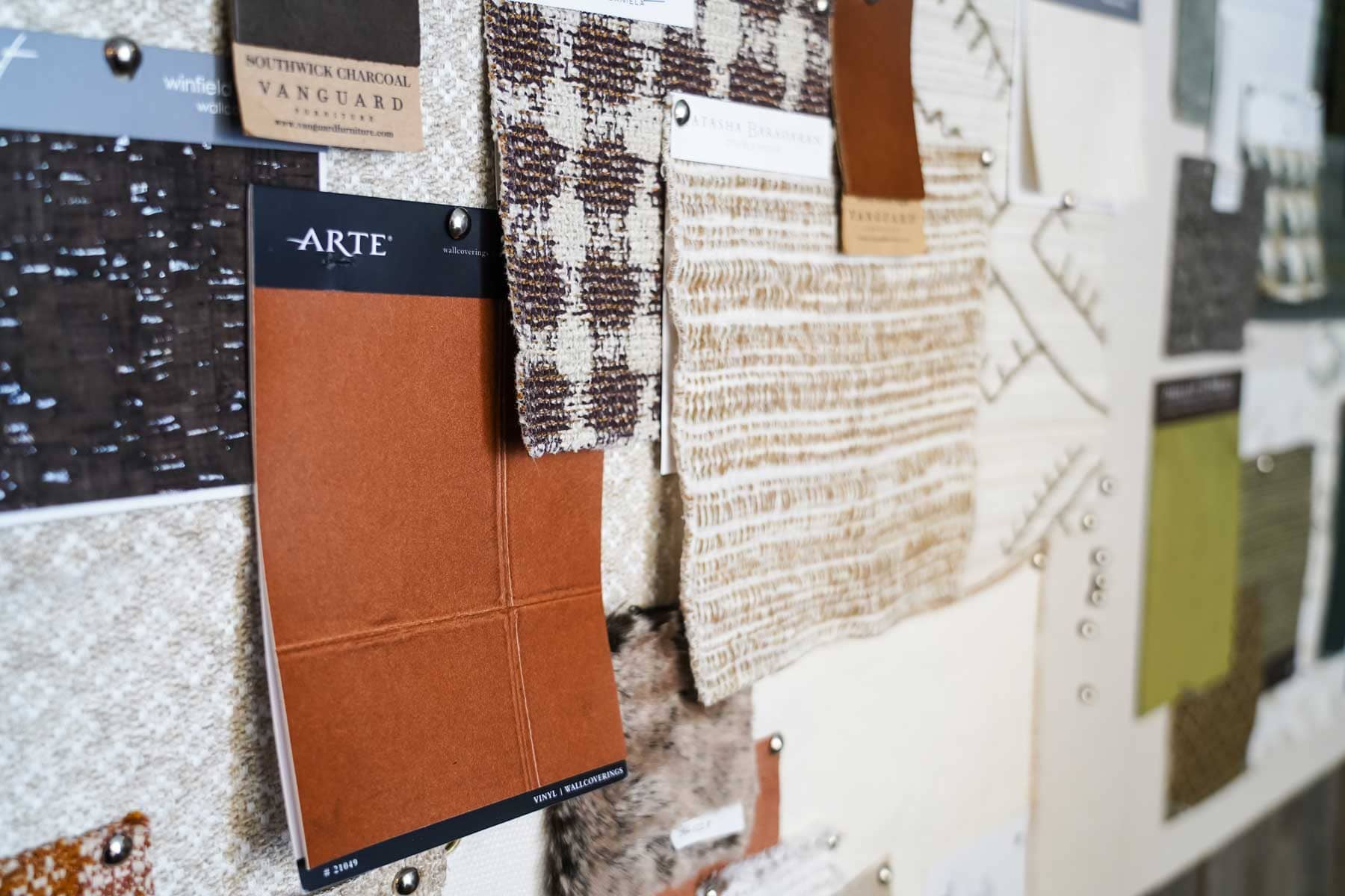
Photo: Colleen Euclide
Color is powerful, but texture brings it to life. We’re seeing an embrace of natural materials—think hide rugs, lambskin throws and wood with visible grain. These elements add richness and dimension, creating a home that feels collected and lived-in, never over-designed. One of our favorite approaches is choosing organic materials that naturally combine multiple hues, for added depth, making it effortless, yet elevated.
Sleek to Cozy
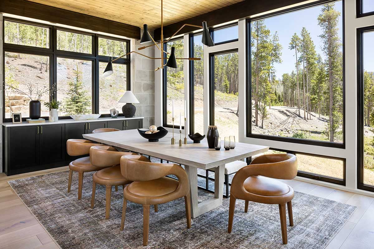
Photo: Kimberly Gavin
In recent projects, we’ve seen a clear shift away from modern greys and high-gloss finishes in favor of warmth and texture. In one remodel, we transformed a space defined by cool tones and sharp lines by layering in soft blue-greys, natural wood paneling and tactile textiles. The result? A home that now feels inviting, personal and in harmony with its alpine setting—even across expansive, open layouts.
Grounded, Layered, Enduring
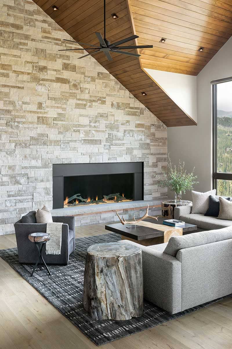
Photo: Kimberly Gavin
The 2025 palette for mountain homes isn’t just about color—it’s about creating a true sense of place. When chosen with intention, these hues become a reflection of both the environment and the people who inhabit it. It’s a design philosophy that puts feeling first and lets nature lead.
Whether you gravitate toward soft, earthy neutrals or deeper tones for contrast, the goal remains the same: to curate a palette that feels timeless, personal and deeply connected to the landscape.
Shae Brenner is an Associate Designer at Collective Design, a full-service interior design, architecture and curated furniture showroom in Frisco, Colorado. View their profile or contact them at 970-239-8514.
Content for this article provided by Collective Design